UX Research _ UX Web Analysis _ Municipalidad de Heredia . Costa Rica
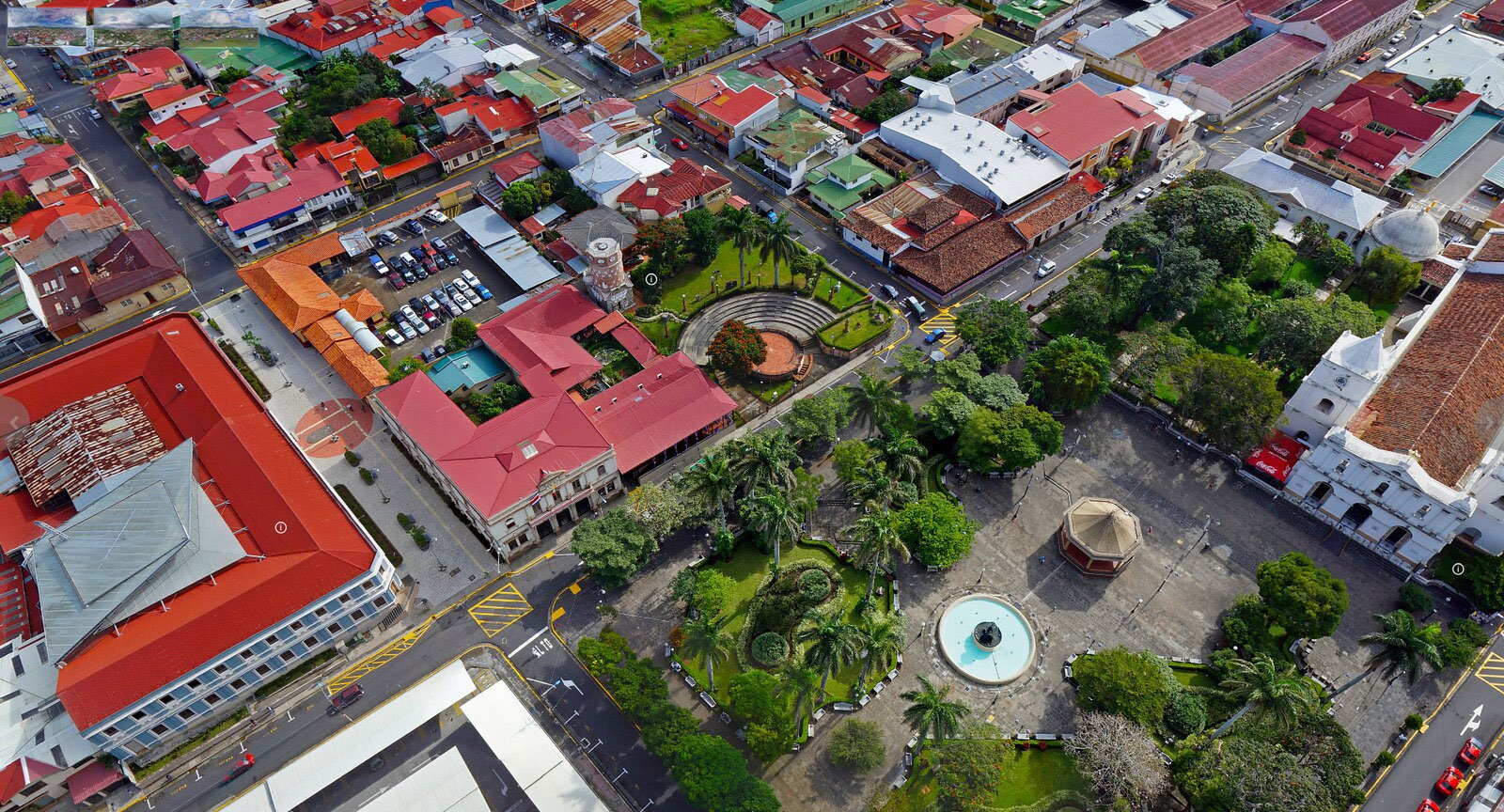
Municipalidad de Heredia or Heredia’s City hall.
Serve as buildings for governmental functions, but also watches for various: civic and cultural activities for their citizens.
THE BRIEF
Every year there is an evaluation at the national level to rank the websites of government institutions. The municipality of Heredia wanted an analysis of their website evaluation, actual falls and how to improve it.
👉 I worked on this project under HowellHutt Design Studio, in collaboration with another UX Designer.
FINDINGS
The first activity was an Herustic analysis, where easily could found :
Nomenclature problems
Dead ends in the navigation
Poor content. Quality of it
Bad hierarchy of content and sections
With the Citizen Interviews, we wanted to validate our stakeholder's affirmations and we found out:
90% of the interviewees didn’t even know that the city hall had a website
16% of the interviewees informed themself from the Facebook page of the Municipalidad.
57% of the users’ respondents get the requirements of the paperwork they need to do at the city hall from friends or other citizens. word of mouth.
To continue, was very useful to identify the user, we identified 2 types of patterns:
User - City hall: The type of users with an interest in the municipality: for example the users that have to pay their taxes at the city hall.
City hall - User: The type of relationship where the municipality has a responsibility to the users. To inform initiatives, cultural activities, transparency and so.
Once we had the users identified were powerful to continue with the user journey activity, we identified:
50 opportunities to improve the website. Content-wise, or with features, that digitalize the experience of the users at the website.
For example Personalization features, reminders, interactive maps… etc.
Analytics analysis revealed:
17% of the users visit the homepage. Very low compared with the stakeholders' expectations.
63% of the users on mobile drop the visit. it means a gap of improvement here.
Behavior patterns that match our hypothesis about users-city hall relation-interests.
Government evaluation: We had the chance to try and do the test ourselves and with the stakeholders. Our interesting finding about it:
The stakeholders got worst evaluation results than the one given (by 10 points less), and it was very important for us, so they could realize the evaluation criteria and the pain points to improve.
An interesting fact was, that the city hall of Heredia was the one with the better rank compared with the other city halls of the country.
Once we got all the previews activities was time to share all the gathered requirements (188 items into 8 categories) so then, the stakeholders and tech team could participate in our prioritization workshop. As result, the team decided to focus on: the short - middle, and long-term of emergencies.
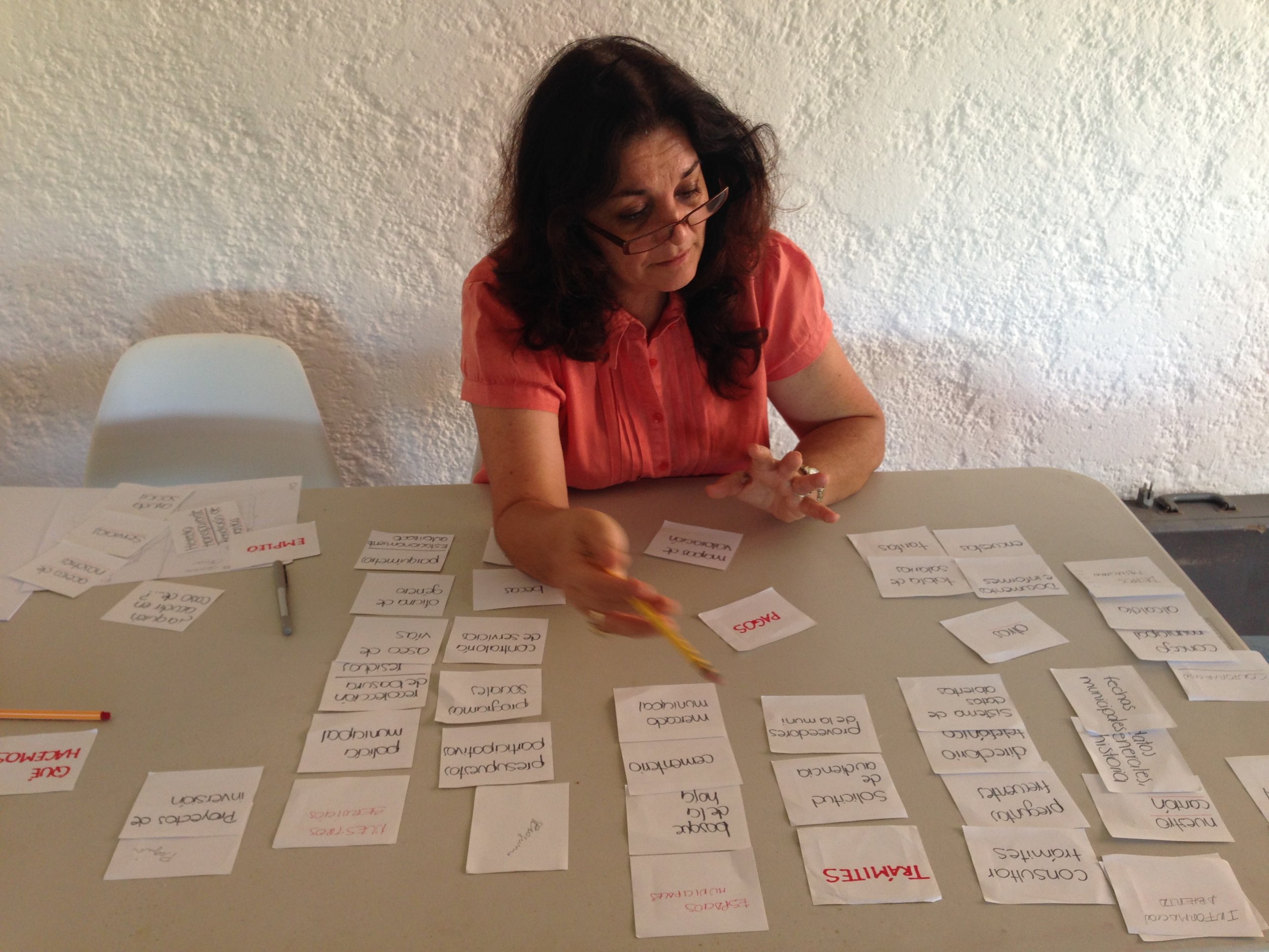
Running a card sorting (with 15 users) we found out and validated some hypotheses from the heuristic analysis :
The naming convention of some sections is confusing.
From the dendrogram we visualize grouping patterns and how users preferred to find the information.
RESULT
New Sitemap : Concise, that gathers main sections for our types of users:
Main menu: for users' interest in the City-hall. Website visitors will first find the information that is directly related to them. Pay taxes, building construction permits etc.
Main Footer: will find complementary information of the City-hall. About us - our values - etc. most of it: is passive information.
Secondary Footer: will contain legal section such as terms and conditions etc.
Since we were hired only for the analysis and recommendations we did wireframes only of the new homepage, so they were able to visualize the concept; also created a 150 pages document with all the processes, documentation of the activities, findings, and visual recommendations of best practices for main sections or features we saw opportunities of improvement.
Image 1 . 4 User Personas. 2 for User - City hall / 2 for City hall - User
Image 2 . User Journey
Image 3 . Analytics
Image 4 . Prioritization workshop
Video . Card sorting test
Image 5 . New Sitemap
Video 2 . Documentation


Methodologies for this project:
Heuristic Analysis | Users Interviews | User personas | Gathering requirements | Prioritization workshop | Card sorting test | Sitemap | Wireframes | Documentation


